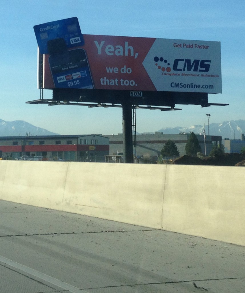
On the highways of Utah, there is a billboard from Complete Merchant Solutions that drives me crazy. I’ve seen it enough times that it’s been really bugging me.

The billboard states “Yeah, we do that too.” while demonstrating a credit card swiper through a mobile phone. It’s as if they’re stating that it’s nice that others have a credit card reader but so do they. In fact, it comes off as a little bit cocky. Except if you notice, it has a credit card facing upwards while everyone knows that the magnetic strip is on the top so to actually use their reader – you would need to flip the card over.
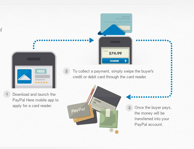
See this example from Paypal.
You can clearly see the credit card correct flipped over in order to process it.
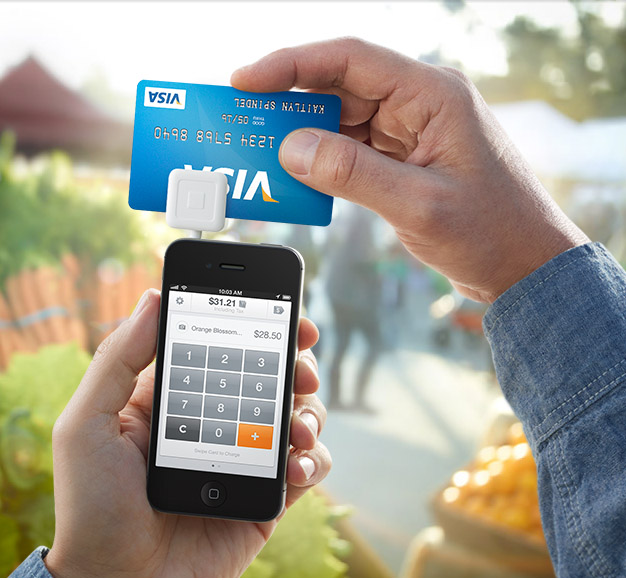
Here’s an example from Square.
Once again, the card is properly flipped around to use the magnetic strip. So if you decide to use CMS for your merchant solutions, don’t follow their example on the billboard. Instead, flip your card around to actually use the magnetic strip. Now I feel a lot better that I’ve shared my visual pain with the rest of you.


Almost as bad as my local Albertson’s supermarket. Underneath the Aisle number, they listed 6 products that could be found in each aisle. In the cookie aisle, the listed crackers, a few other Items and…processed cheese! not one of the 6 items was cookies, although that dominated the shelf space in the aisle. “How can you not list cookies in the cookie aisle?” was my constant plea to each checker. Finally I escalated it to the store manager, who promised to escalate it to corporate. A year later, the store was shut down, never to have the proper sign listing cookies in the cookie aisle. Coincidence?
lol, why would you turn your logo upside down when 99% of ppl won’t notice. Who cares…
@sam – they’re selling the reading service not the card! But yeah it’s kind of silly
Actually I have two cards that swipe exactly like the billboard. One is a debit card. But still, there are cards that swipe and show the logo. Pretty smart marketing in my opinion!
The “let’s show our logo and swipe incorrectly,” advertising methodology has bothered me for years too.
Okay, I thought it was just me when I saw the commercials – glad it isn’t!
I love my square!
This is something that has bothered me for YEARS. Same thing in the commercials on TV where they “swipe” a card for purchase… ugggggh
It’s for show. I remember a Visa or Master Card commercial where they talk about how it’s faster than cash and every swipe makes sure you can clearly see the logo right-side up.
@grace – it’s still irritating 🙂